
News feed


Like a postnatal Kardashian, Instagram today rejoined society with a dramatically different and divisive new face that has launched a thousand headlines.
With an updated icon inspired by the key elements of the previous glyph and a minimal new interface intended to let your brilliant self-portraits shine, Instagram’s new look signals the app’s late arrival to the flat design revolution that was embraced by almost every app with the launch of iOS 7 in 2013.
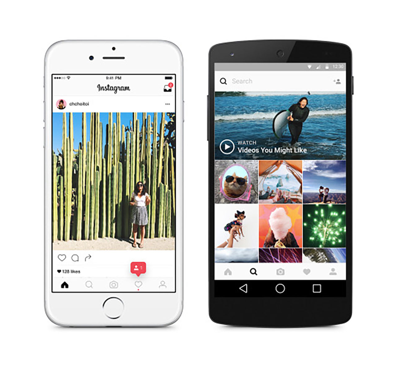
Instagram’s user interface redesign, as seen on iOS and Android devices
Credit: Instagram
In a Medium post outlining the thought process behind the redesign, Instagram’s head of design Ian Spalter explains his team’s decision to “modernise” their look thusly:
“The Instagram icon and design was beginning to feel, well… not reflective of the community, and we thought we could make it better.”
Spalter started the redesign process by asking Instagram employees draw the original icon from memory in five seconds, and found that “almost all of them drew the rainbow, lens and viewfinder.” With that invaluable insight at their disposal, the design team set about creating a simplified glyph “that still suggests a camera, but also sets the groundwork for years to come.”
A universal makeover for the brand’s ancillary apps – Layout, Boomerang and Hyperlapse – soon followed, as did the new user interface, which was stripped of “colour and noise” so that your posts become the (deserving) sole focus when using the app.
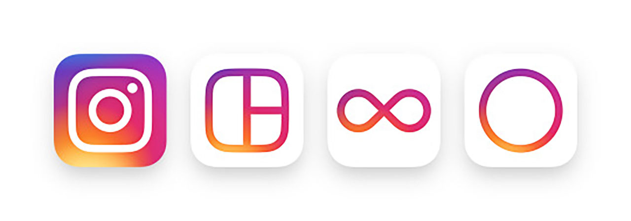
Instagram’s support apps – Layout, Boomerang and Hyperlapse – also received makeovers
Credit: Instagram
So, like a postnatal Kardashian, while everything looks different, rest assured that these changes are purely cosmetic and what’s inside remains essentially the same.
At least until their ratings start to decline.
Title image: Instagram
Cover image: @heysp


