
News feed

When 2016 started, the global colour gurus at Pantone declared it the year of pastel pink and blue (or Rose Quartz and Serenity if we’re going by their Sunday names). But lovers of soft and pretty colours best prepare yourselves: Summer 2017 future’s so bright, you’ll have to wear shades.
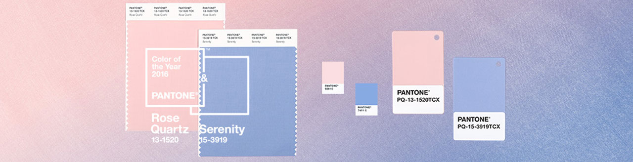
Pretty and Serene are so last season (i.e. 2016)
While experts at the Pantone Color Institute have released a list of their Top 10 tone predictions based on the preferred colour palettes of designers at the most recent New York Fashion Week, it’s the top three we’re most fascinated with: Niagara, Primrose Yellow and Lapis Blue.
The rest were (according to their official Pantone names) Flame, Island Paradise, Pale Dogwood, Greenery, Pink Yarrow, Kale and Hazelnut. (You can understand why we were a touch less excited about the last two than the likes a yellow tagged from a flower.)
Summer’s top colour: Niagara Aka pale denim, this softer blue was spotted, amongst other shows, at Carolina Herrera, Anna Sui and Joseph Altuzarra.
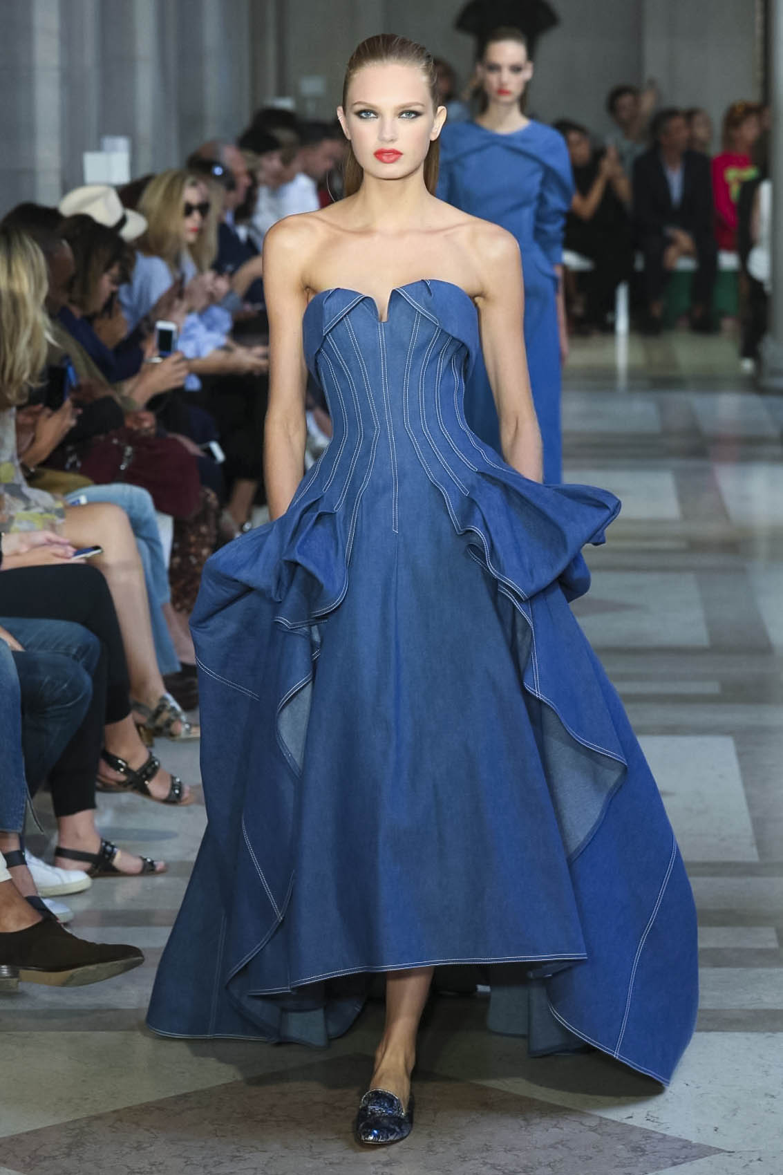
Carolina Herrera SS17
Altuzarra SS17
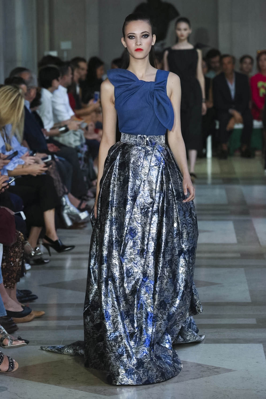
Carolina Herrera SS17
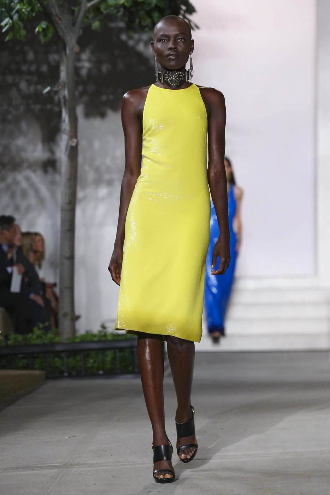
In second place: Primrose Yellow As seen on ahead-of-the-game street style mavens and the runways of Jeremy Scott, Boss Woman, Lacoste, Ralph Lauren and Tory Burch.
Jeremy Scott SS17
Ralph Lauren SS17
Lacoste SS17
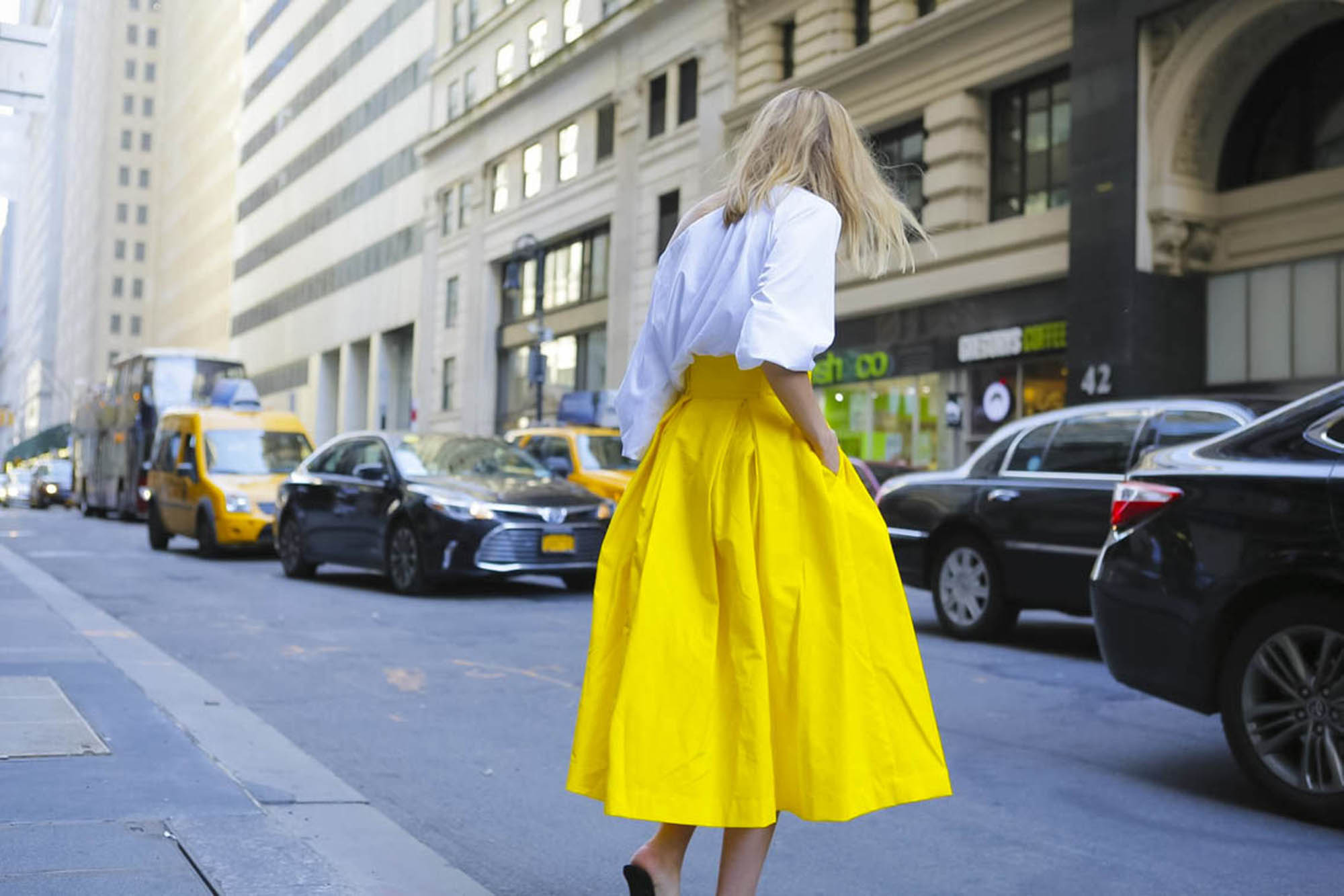
Street Style at NYFW
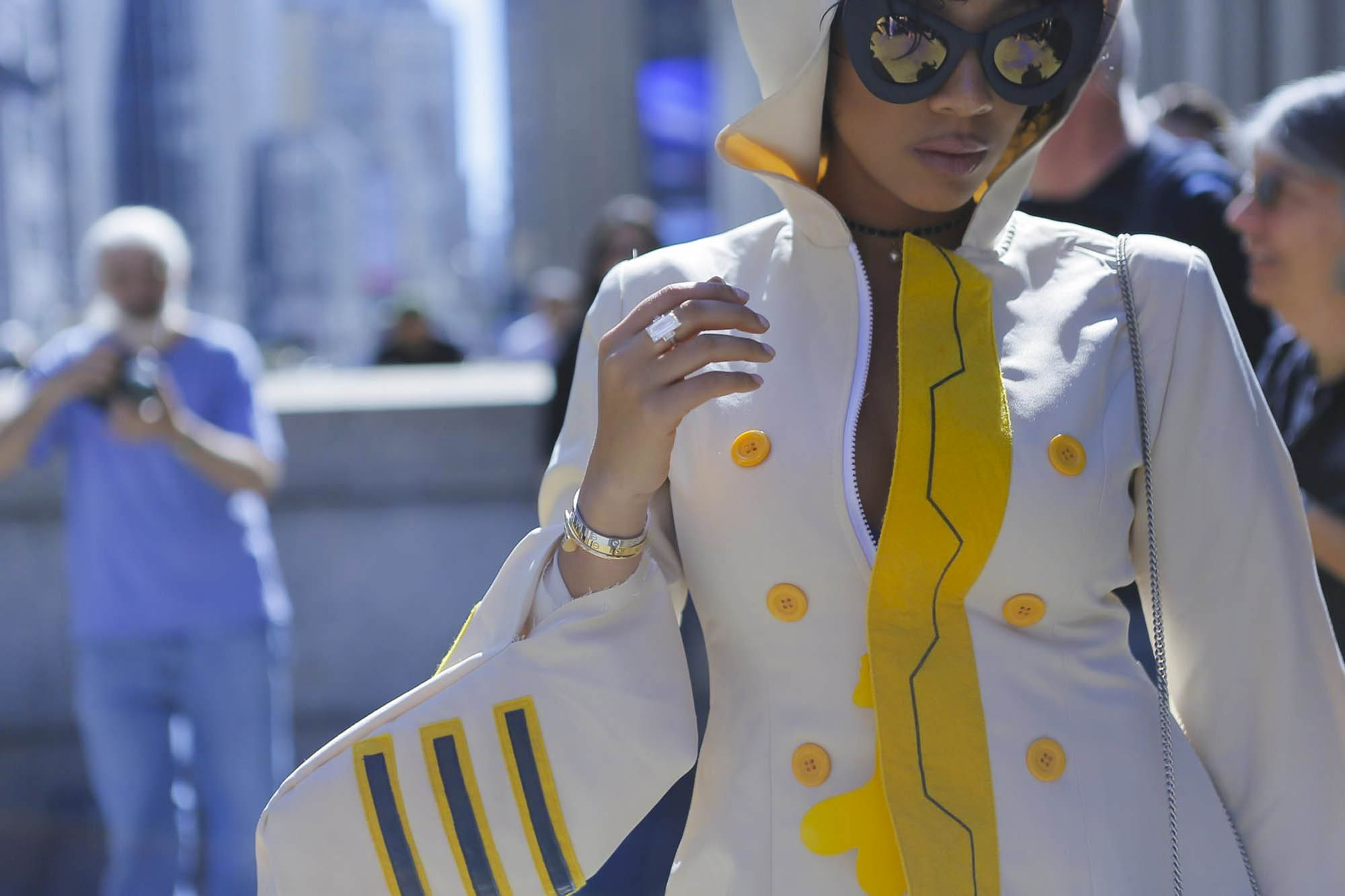
Street Style at NYFW
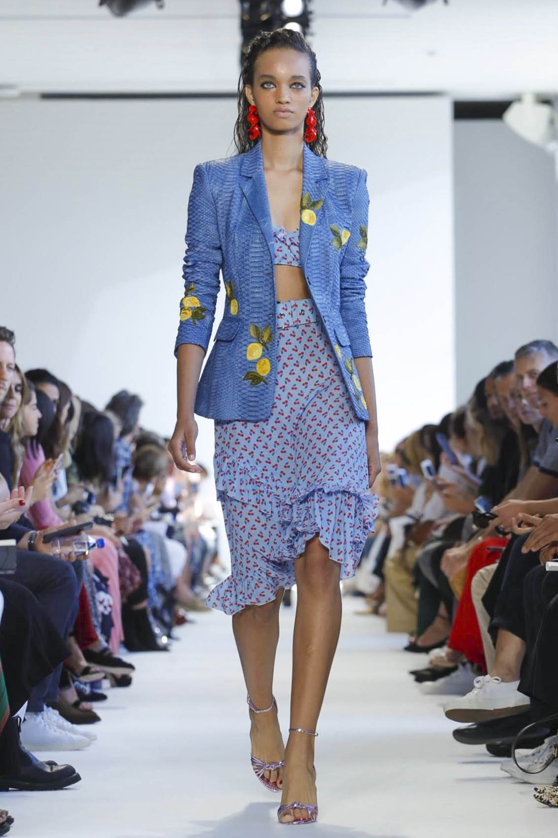
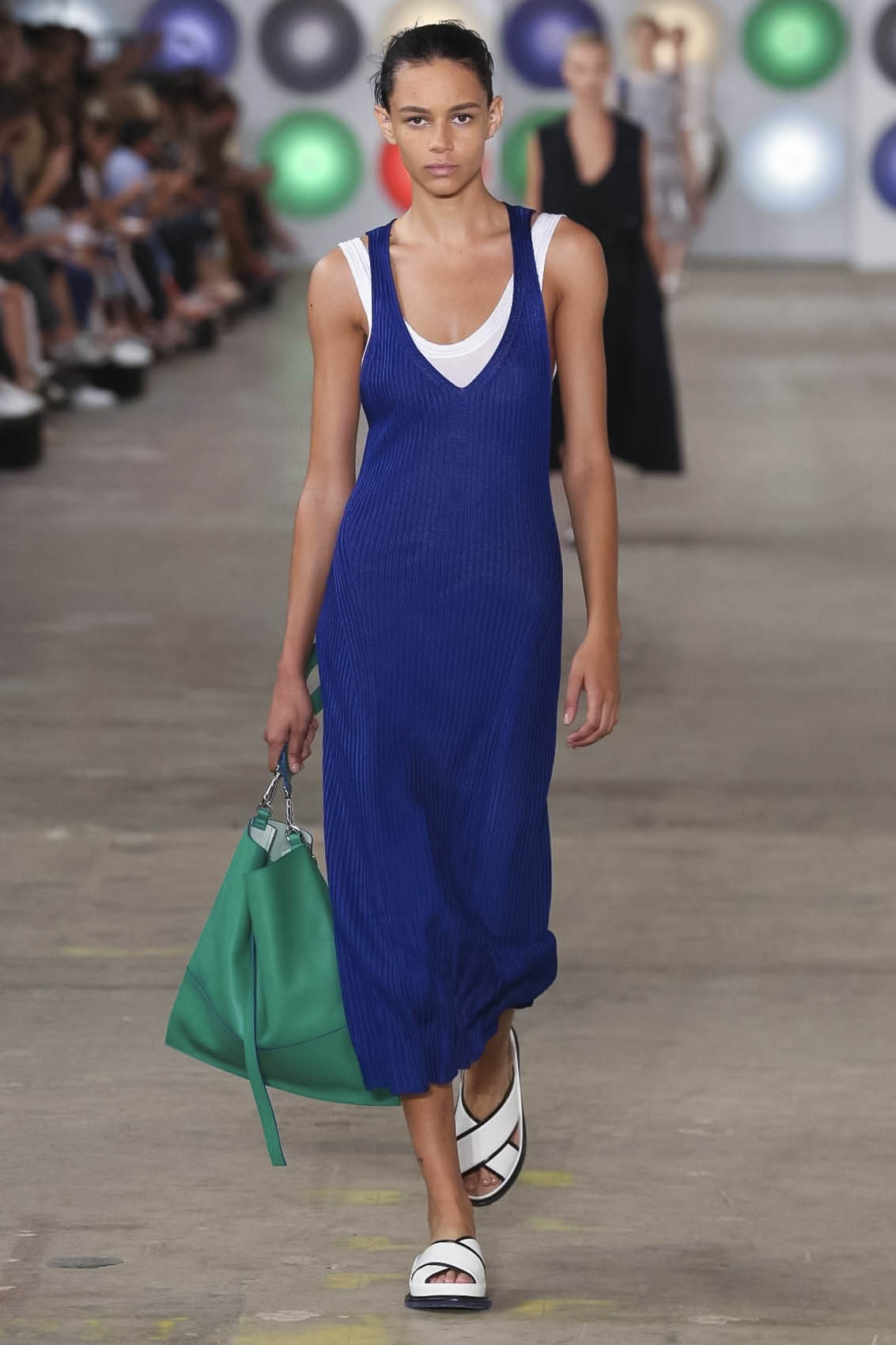
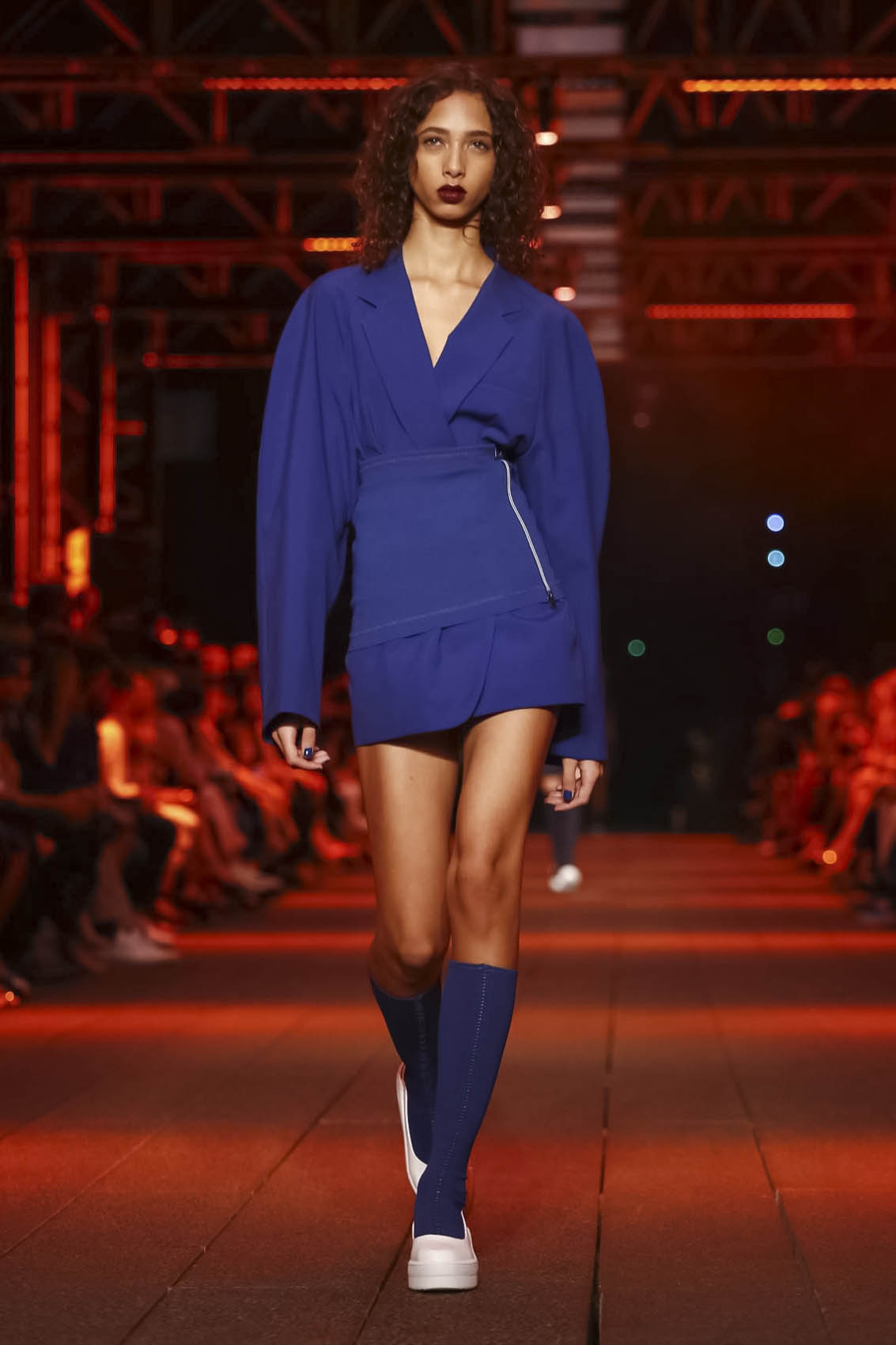
Coming in a close third: Lapis Blue A brighter and more eye-catching take on the traditional royal blue, spotted at Boss Woman, DKNY, Prabal Gurung, Jeremy Scott and Ralph Lauren.
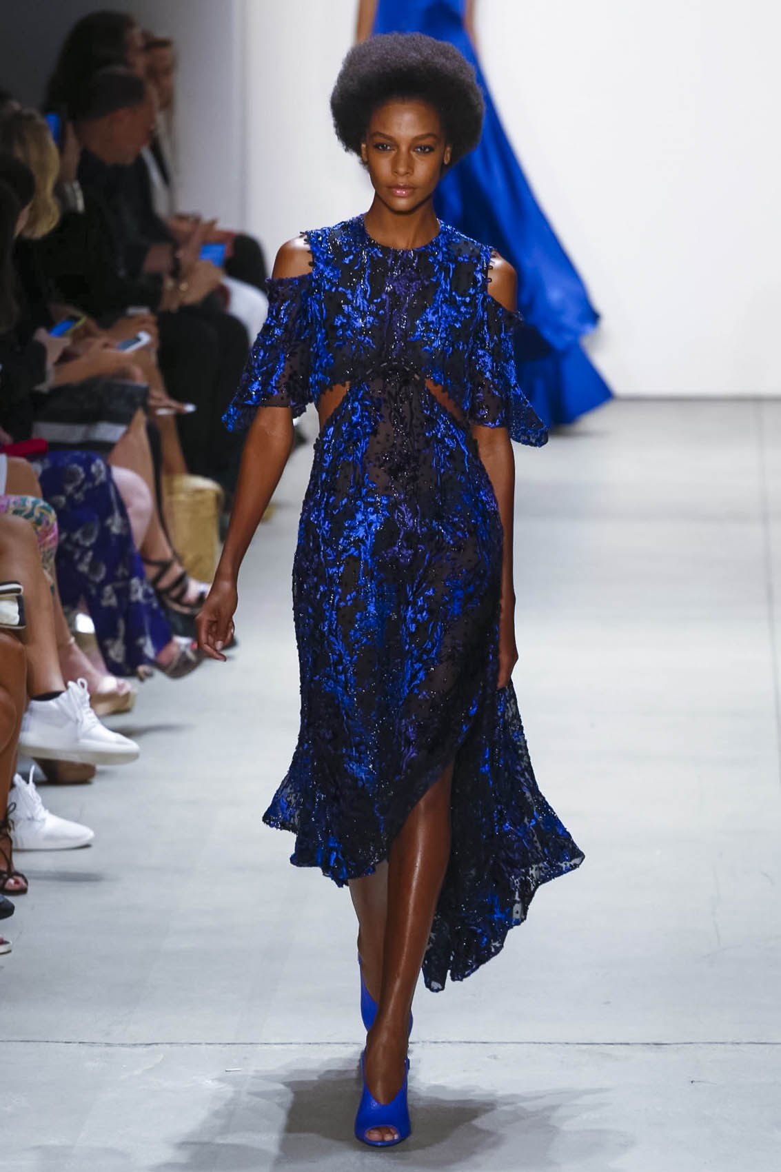
Prabal Gurung SS17
Boss Woman SS17
DKNY SS17
Credit: all images NOWFASHION


